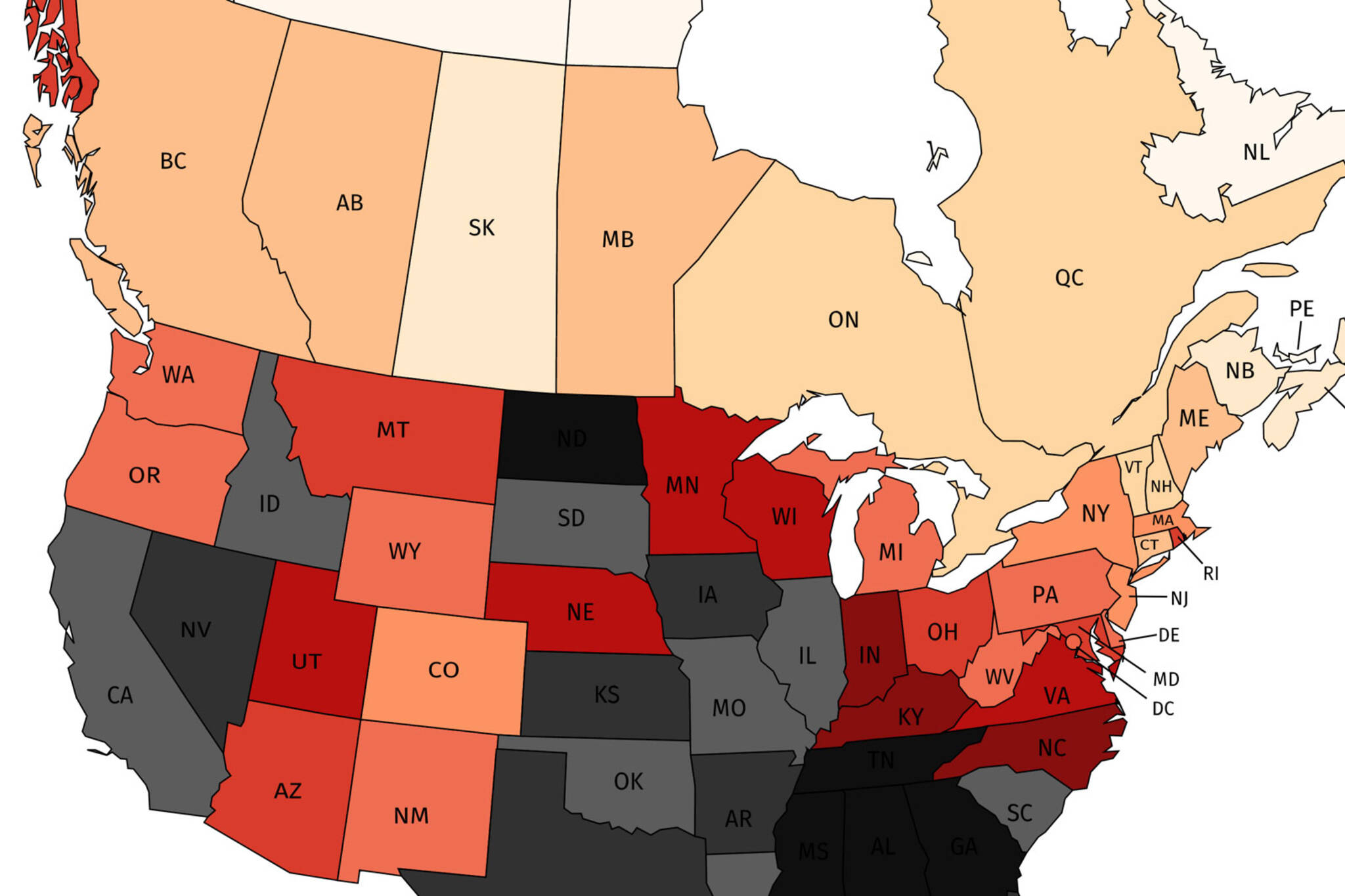
Map of COVID-19 cases in the U.S. vs Canada shows why border should stay closed
Sometimes you need to see it to believe it; Canada has known for a while that the U.S. is struggling to control the spread of COVID-19, but a new map shows exactly how stark the difference in daily case numbers actually is.
A Reddit user recently created a map showing the average daily COVID-19 cases (seven-day average) per million people, using data gathered by CTV News and Johns Hopkins University.
And while the legend breaks down the case numbers in more detail, generally speaking, dark colours aren't a good sign.

A map from a Reddit user illustrates the difference in average daily cases per population between Canada and the United States
As you can see, Canada's colours are much lighter than our neighbours south of the border.
It's unfair to lump all of the U.S. together, of course; states like Vermont and New Hampshire are doing better than Manitoba and Alberta, for example.
But overall, the United States still has some work to do when it comes to flattening the curve.
Since plenty of Canadians have friends, family and loved ones south of the border, many people can only watch in trepidation as our neighbours to the south struggle to battle the virus.
Canadians eager to keep border shut after U.S. changes COVID-19 testing rules https://t.co/HbylwJONLi #Canada #Trump #COVID19Canada #CDC
— Freshdaily (@freshdaily) August 26, 2020
And with the CDC now updating its COVID-19 testing guidelines to exclude people that have been exposed to the virus, it looks like Canadians may have even more reason to worry for our neighbours' health in the near future and insist the border remain closed.
Latest Videos
Join the conversation Load comments


